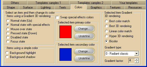
The simplest way to change the button colors is to open, at Design-time, the 3D Button Visual Editor application from inside the Visual Studio.NET IDE as described inside the chapter Editing control properties through the 3D Button Visual Editor application contained inside the "How to use the product in your projects" section and selecting the editor "Color" tab; as you will see on the table below the image, you can reach all of these settings at runtime using the corresponding property.
Note: The images below have hot links to take you to explanations of the various button settings.
|
Item name
|
Description
|
Corresponding property
|
|
Normal state (Up)
|
Background color settings of the button surface in Normal state.
|
ColorSurfaceNormal
|
|
Normal state with special effects
|
Background color settings of the internal part of the button surface when a special effect has been applied (see SpecialEffect property for details about special effects).
If this color is left undefined, the ColorSurfaceNormal property settings apply.
|
ColorSurfaceInternal
|
|
Mouse over state
|
Background color settings of the button surface when the mouse pointer is over the button area.
If this color is left undefined, the ColorSurfaceNormal property settings apply.
|
ColorSurfaceMO
|
|
Pressed state (Down)
|
Background color settings of the button surface in Pressed state.
If this color is left undefined, the ColorSurfaceNormal property settings apply.
|
ColorSurfacePressed
|
|
Disabled state
|
Background color settings of the button surface in Disabled state.
If this color is left undefined, the ColorSurfaceNormal property settings apply.
|
ColorSurfaceDisabled
|
|
Focus state
|
Background color settings of the button surface when the button has the input focus.
If this color is left undefined, the ColorSurfaceNormal property settings apply.
|
ColorSurfaceFocus
|
|
Background highlight
|
The color used to highlight the raising and sunken effect on a button.
If this color is left undefined, its value is automatically calculated using the current surface color of the button.
|
HighlightColor
|
|
Background shadow
|
The shadow color of the button which applies when the button has a raised or sunken special effect.
This color is also used to render the shadow set through the ShadowMode property.
If this color is left undefined, it would be automatically calculated using the current surface color of the button.
|
ShadowColor
|
|
Swap special effect colors
|
When a special effect has been selected through the SpecialEffect property, swaps the colors set for the external and internal portions of the button's surface.
|
SwapEffectsColor
|
The properties ColorSurfaceNormal, ColorSurfaceMO, ColorSurfaceInternal, ColorSurfaceFocus, ColorSurfaceDisabled and ColorSurfacePressed are internally implemented as "expandable objects" of class SurfaceColor: thanks to this "object oriented" approach, each of these properties have a set of sub-properties that allow a better control of the following aspects of the "Gradient 3D color rendering":
|
Item name
|
Description
|
Corresponding property
|
|
Selected item primary color
|
Color associated to the selected item
|
SurfaceColor.BackColor
|
|
Selected item secondary color
|
Secondary color used when the SurfaceColor.Render3DType property is set to COLOR_RENDER_2_COLORS
|
SurfaceColor.BackColor2
|
|
"Change..." button
|
This button will open the color choice dialog box
|
|
|
"Undefine" button
|
This button will set the color associated to the selected item to an undefined state: when the primary color is set to undefined, the selected item will use the ColorSurfaceNormal property settings.
The undefined state is represented with the  symbol in place of the color. symbol in place of the color.
|
|
|
Best color match
|
Causes the button to adopt a gradient algorithm that will maintain the chosen color characteristics
|
SurfaceColor.Render3DType set to ColorRenderType.BestMatch
|
|
Best 3D rendering
|
Causes the button to adopt a gradient algorithm that will enhance the 3D look of the button surface
|
SurfaceColor.Render3DType set to ColorRenderType.Best3D
|
|
Linear color match
|
Causes the button to adopt a linear gradient algorithm that will maintain the chosen color characteristics
|
SurfaceColor.Render3DType set to ColorRenderType.LinearMatch
|
|
Hyper 3D rendering
|
Causes the button to adopt an extended 3D gradient algorithm that will further enhance the 3D look of the button surface
|
SurfaceColor.Render3DType set to ColorRenderType.Hyper3D
|
|
Bicolor
|
Causes the button to adopt a 3D gradient algorithm that makes use of two colors
|
SurfaceColor.Render3DType set to ColorRenderType.TwoColors
|
|
Gradient type
|
Chooses the type of gradient 3D rendering
|
SurfaceColor.GradientType
|
|
Gradient factor
|
Chooses the factor applied to the gradient 3D rendering algorithm
|
SurfaceColor.GradientFactor
|
Notes
This section focuses on the shading of the button, not the button's text. To review that topic, go to How to put text over the control.
This section doesn't cover the coloring of the following surfaces:
Vista's Aero style
Office 2003 style
Office 2007 style
|


