Copyright © 1998-2006 MultiMedia Soft 
Return to index  
 
How to manage cells 
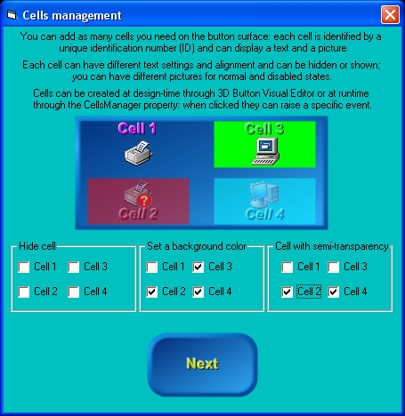
Starting from version 8 of the control, you have the opportunity to add as many cells you want to the button surface, both at design-time, through 3D Button Visual Editor, and at runtime through the CellsManager property (that internally implements the CellsManager COM object). 
Each single cell can have the following features: 
  • Position and size 
  • Visibility 
  • Solid background with border and alpha channel transparency support 
  • Fully configurable caption text 
  • Picture for control's normal and disabled states with alignment and alpha channel transparency support 
  • Dedicated Click event (CellClick
  •  
    Let's see how to create our cells at Design-time: 
  • Inside 3D Button Visual Editor, click the "Manage Cells" button as shown below 
  •  
  • The cells management User Interface will appear as shown below: at any time you can go back to the standard user interface pressing the "Manage Control" button; as you can see, most of the cells management User Interface is disabled: the first thing to do is to press the "Add" button to add a new cell. 
  •  
  • After pressing the "Add" button, a dialog box will require to identify the new cell with a numerical UniqueID (Unique IDentification number): this UnqiueID will be used at runtime to identify existing cells from each other; as you can see on the screenshot below, the User Interface will suggest you the UniqueID: you are in any case free to assign to the new cell the UniqueID you prefer. Pressing the "OK" button will create the new cell and will add it to the cells listbox. 
  •  
  • You can now add as many cells as you need and then change the respective settings as explained on the sections below. 
  •  
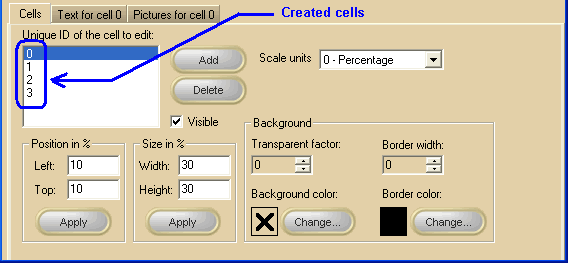
    General settings 
    Actually there is no limit to the number of cells you can create inside a control (apart from your PC memory and resources) ; on the screenshot below, you can see that 4 cells have been created and listed inside the white listbox: note that the visible settings are relative to the cell selected inside the listbox: changing the selected cell will cause the various settings to be automatically updated and the Text and Pictures tabs will change their label in order to remember you which of the available cells is under editing. 
    Note: The image below has hot links to take you to explanations of the various controls: the property/method on the right column can be used at runtime. 
    -- -- -- -- -- -- -- -- -- -- -- -- -- -- -- -- -- --  
     
     
    Item name
    Description
    Corresponding property/method
     
    Unique IDs listbox
    Contains the list of the available cells Unique IDs
     
    "Add" button
    Creates a new cell
     
    "Delete" button
    Deletes the selected cell
     
    Visible
    Sets/resets the selected cell visibility
     
    Position in % X
    The horizontal cell position expressed in percentage of the control width
     
    Position in % Y
    The vertical cell position expressed in percentage of the control height
     
    Size in % Width
    The cell width expressed in percentage of the control width
     
    Size in % Height
    The cell height expressed in percentage of the control height
     
    "Apply" buttons
    Apply the respective settings
     
     
    Background transparent factor
    Applies alpha channel transparency to the cell background color (if any)
     
    Background color
    Applies a color to the cell background: if no color is applied (situation represented with the  symbol inside the color box) the cell background will result completely transparent
     
    Border width
    If set to 1 or higher, adds a border line to the cell
     
    Border color
    Applies a color to the cell's border (if any): the default color is black
     
    Change buttons
    These buttons will open the color choice dialog box for the corresponding property.
     
     
    At runtime you can also: 
  • retrieve the total number of available cells using the CellsManager.GetCount method and the UniqueID for each of them using the CellsManager.GetCellUniqueID method. 
  • understand if a cell with a certain UniqueID exists using the CellsManager.FindCell method. 
  •  
    Text settings for a specific cell 
    Note: The image below has hot links to take you to explanations of the various controls: the property/method on the right column can be used at runtime. 
    -- -- -- -- -- -- -- -- -- -- -- -- -- -- -- -- -- -- -- -- -- -- -- -- -- -- -- -- --  
     
    Item name
    Description
    Corresponding property


    Text
    The text that will appear over the button: it can be multi-line (press the Enter key each time you need to create a new line of text).
     
    Visible
    Hides/shows the selected text
     
    Alignment
    Horizontal and vertical text alignment
     
    Offset X
    Offset from the default horizontal position
     
    Offset Y
    Offset from the default vertical position
     
    Effect
    Enhancement special effect applied to text
     
    Factor
    Enhancement special effect factor
     
    Double space
    Applies/removes double space (Available only with Professional edition)
     
    Antialias
    Applies/removes anti-aliasing to text borders (Not available with Light edition)
     
    Transparency
    Applies alpha channel transparency to text. (Available only with Professional edition)
     
    Rotation angle
    Text rotation angle (Available only with Professional edition)
     
    Normal Color (Up)
    Text color when the button is in Normal state.
     
    Mouse over Color
    Text color when the mouse is over the button surface: if this color is left undefined the Normal Color will be used. 
    The undefined state is represented with the  symbol inside the color box. Once the color has been defined, it can be reset back to the undefined state by double-clicking the relative color box (not the "..." button).
     
    Pressed Color (Down)
    Text color when the button is in Pressed state: if this color is left "undefined" the Normal Color will be used. 
    The undefined state is represented with the  symbol inside the color box. Once the color has been defined, it can be reset back to the undefined state by double-clicking the relative color box (not the "..." button).
     
    Highlight effect color
    Color of the highlighted text portion (available when a special effect is applied): if this color is left undefined the color will be calculated automatically. 
    The undefined state is represented with the  symbol inside the color box. Once the color has been defined, it can be reset back to the undefined state by double-clicking the relative color box (not the "..." button).
     
    Shadow effect color
    Color of the shadowed text portion (available when a special effect is applied): if this color is left undefined the color will be calculated automatically. 
    The undefined state is represented with the  symbol inside the color box. Once the color has been defined, it can be reset back to the undefined state by double-clicking the relative color box (not the "..." button).
     
    Halo effect color
    Color used to create a Halo special effect.
     
    Solid background Color
    Applies/removes a solid background under the text position (Available only with Professional edition).
     
    Background border Color
    Applies/removes a border.
     
    Background shadow Color
    Applies/removes a shadow.
     
    "..." color editing buttons
    These buttons will open the color choice dialog box for the corresponding property.
     
     
    Font related properties can be retrieved/modified at runtime using the CellsManager.GetLogFont and CellsManager.SetLogFont that will manage a standard Windows LOGFONT data structure. 
     
    Item name
    Description
    Corresponding LOGFONT field
     
    Font
    The font name (also known as typeface or facename): only TrueType (marked with the symbol) and OpenType (marked with the symbol) fonts are supported.
    lfFaceName
     
    Size
    The height of the button expressed in points
    lfHeight
     
    B Bold checkbox
    Sets/resets the bold attribute
    lfWeight
     
    I Italic checkbox
    Sets/resets the italic attribute
    lfItalic
     
    U Underline checkbox
    Sets/resets the underline attribute
    lfUnderline
     
    S Strikethrough checkbox
    Sets/resets the strikethrough attribute
    lfStrikeOut
     
    Pictures settings for a specific cell 
    Note: The image below has hot links to take you to explanations of the various controls: the property/method on the right column can be used at runtime. 
    -- -- -- -- -- -- --  
     
     
    Item name
    Description
    Corresponding property/method


    Picture for normal state
    The picture file displayed on the cell surface when the button is in Normal state.
     
    Picture for disabled button
    The picture file displayed on the cell surface when the button is in Disabled state.
     
    Transparent factor
    Apply alpha channel transparency to the loaded pictures
     
    Alignment
    Changes the picture or animation position over the cell.
     
    Browse button
    Browses the current PC folders for a picture.
     
     
    Delete button
    Deletes the current picture.
     
     
    Preview
    Preview of the loaded picture.


    Copyright © 1998-2006 MultiMedia Soft 
    Return to index