Copyright © 1998-2015 MultiMedia Soft

How to manage colors of Vista's Aero style

Previous pageReturn to chapter overviewNext page

The control can assume the appearance of a Vista's Aero style button by setting its Surface property to SURFACE_VISTA_AERO.

The Vista' Aero style has several dedicated colors which replace the default colors set through the BackColor and ColorSurfaceNormal properties (with the exception of the outer border drawn when the SpecialEffect property is set to a value different from SPECIAL_EFFECT_NONE); these colors can be summarized in 3 main categories:

Borders colors

The Aero style has 3 borders as seen on the image below:

3dabm_i00013e

The color of these borders can be set through the VistaColorOuterBorder, VistaColorMiddleBorder and VistaColorInnerBorder properties: the inner border can have a different color when the button is in pressed state through the use of the VistaColorInnerBorderPressed property.

The width in pixels of each border can be defined using the VistaOuterBorderWidth, VistaMiddleBorderWidth and VistaInnerBorderWidth properties.


Glossy effect colors

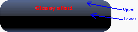
The glossy effect is applied on the Northern half of the button as seen on the image below:

3dabm_i000142

The glossy effect is rendered through a vertical linear gradient made up of 2 colors, one defining the upper portion of the effect and one defining the lower portion of the effect. Depending upon the state of the button, these colors can be emphasized through the use of a further overlapping color having a varying opacity; below a summary of the various button states with the involved properties


Normal

VistaColorGlossyEffectUpper and VistaOpacityGlossyEffectUpper

VistaColorGlossyEffectLower and VistaOpacityGlossyEffectLower


Pressed

VistaColorGlossyEmphUpperPressed and VistaOpacityGlossyEmphUpperPressed

VistaColorGlossyEmphLowerPressed and VistaOpacityGlossyEmphLowerPressed


Mouse over

VistaColorGlossyEmphUpper and VistaOpacityGlossyEmphUpper

VistaColorGlossyEmphLower and VistaOpacityGlossyEmphLower


Glow effect colors

The glow effect is applied on the Southern half of the button as seen on the image below:

3dabm_i000144

The glow effect is rendered through the combination of a background color, a linear gradient positioned on the bottom of the button and a radial gradient having its center positioned on the center-bottom of the button. Usually the glow effect is only visible when the mouse hovers the button's surface.

Properties involved in this rendering are the following:

VistaColorGlowBack property represents the color used to render the background of the glow effect.

VistaColorGlowBottom property represents the color used to render the linear gradient.

VistaColorGlow property represents the color used to render the radial gradient when the mouse hovers the button surface

VistaColorGlowChecked property represents the color used to render the radial gradient when the button is in checked state (for example for checkboxes and radio buttons)

VistaColorGlowCheckedMouseOver property represents the color used to render the radial gradient when the mouse hovers the button surface and the button is in checked state (for example for checkboxes and radio buttons)


For checkboxes and radio buttons in checked state there are still 2 color elements used to define an overall background color of the button's surface: the VistaColorBackgroundChecked property and the VistaColorBackgroundCheckedMouseOver property.


As you have seen, coloring of the button surface depends upon the button's status: you can change this behaviour through the VistaLook property.

The shape of the Glossy effect can be modified through the VistaGlossyShape property and the transition to the Glow effect can be kept smooth through the VistaGlossySmoothFactor property; a button like this:

3dabm_i000145

could be transformed acting on the VistaGlossyShape property

3dabm_i000148

and on the VistaGlossySmoothFactor property

3dabm_i000146

just for curiosity, by simply adding a white spotlight we would finally obtain a good looking lucid effect (see the How to manage surface lighting tutorial for details):

3dabm_i000147


The simplest way to change colors and options applied to the Vista's Aero style is to use, inside 3D Button Visual Editor, the Vista's Aero style tab. At run-time each of these properties can be referenced by name.

Note: The images below have hot links to take you to explanations of the various button settings.

3dabm_i000149


Item name

Description

Corresponding property


Glossy effect Upper color

The gradient color used for the upper portion of the glossy effect in normal state

VistaColorGlossyEffectUpper


Glossy effect Upper opacity

The alpha channel based opacity factor applied to the upper portion of the glossy effect in normal state

VistaOpacityGlossyEffectUpper


Glossy effect Lower color

The gradient color used for the lower portion of the glossy effect in normal state

VistaColorGlossyEffectLower


Glossy effect Lower opacity

The alpha channel based opacity factor applied to the lower portion of the glossy effect in normal state

VistaOpacityGlossyEffectLower


Glossy effect emphasize upper color mouse over

The gradient color used for emphasizing the upper portion of the glossy effect in mouse over state

VistaColorGlossyEmphUpper


Glossy effect emphasize upper opacity mouse over

The alpha channel based opacity factor applied for emphasizing the upper portion of the glossy effect in mouse over state

VistaOpacityGlossyEmphUpper


Glossy effect emphasize lower color mouse over

The gradient color used for emphasizing the lower portion of the glossy effect in mouse over state

VistaColorGlossyEmphLower


Glossy effect emphasize lower opacity mouse over

The alpha channel based opacity factor applied for emphasizing the lower portion of the glossy effect in mouse over state

VistaOpacityGlossyEmphLower


Glossy effect emphasize upper color pressed

The gradient color used for emphasizing the upper portion of the glossy effect in pressed state

VistaColorGlossyEmphUpperPressed


Glossy effect emphasize upper opacity pressed

The alpha channel based opacity factor applied for emphasizing the upper portion of the glossy effect in pressed state

VistaOpacityGlossyEmphUpperPressed


Glossy effect emphasize lower color pressed

The gradient color used for emphasizing the lower portion of the glossy effect in pressed state

VistaColorGlossyEmphLowerPressed


Glossy effect emphasize lower opacity pressed

The alpha channel based opacity factor applied for emphasizing the lower portion of the glossy effect in pressed state

VistaOpacityGlossyEmphLowerPressed


Background color for checked state

The color used for rendering the button's background in checked

VistaColorBackgroundChecked


Background color for checked and mouse over state

The color used for rendering the button's background in checked and mouse over state

VistaColorBackgroundCheckedMouseOver


Glow effect Background color

The color used for rendering the background of the glow effect

VistaColorGlowBack


Glow effect Bottom color

The color used for rendering the linear gradient of the bottom of the glow effect

VistaColorGlowBottom


Glow effect Foreground color

The color used for rendering the radial gradient of the glow effect

VistaColorGlow


Glow effect Foreground color in checked state

The color used for rendering the radial gradient of the glow effect in checked state

VistaColorGlowChecked


Glow effect Foreground color in checked and mouse over state

The color used for rendering the radial gradient of the glow effect in checked and mouse over state

VistaColorGlowCheckedMouseOver


Outer border color and width

The color and width in pixels used for rendering the outer border

VistaColorOuterBorder and VistaOuterBorderWidth


Middle border color and width

The color and width in pixels used for rendering the middle border

VistaColorMiddleBorder and VistaMiddleBorderWidth


Inner border color and width

The color and width in pixels used for rendering the inner border

VistaColorInnerBorder and VistaInnerBorderWidth


Inner border pressed color

The color used for rendering the inner border in pressed state

VistaColorInnerBorderPressed


Glossy shape

The shape applied to the glossy effect

VistaGlossyShape


Glossy smooth factor

The smoothing factor applied to the glossy effect

VistaGlossySmoothFactor


Vista look

The look of the button when in normal state.

VistaLook