|
How to manage cells |
  
|
|
How to manage cells |
|
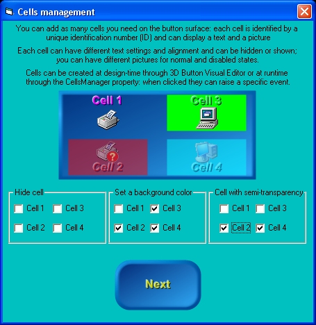
Starting from version 2 of the control, you have the opportunity to add as many cells you want to the control's surface, both at design-time, through 3D Button Visual Editor, and at runtime through the CellsManager property that is internally implemented as an "expandable object" of class CellsManagerDesc: thanks to this "object oriented" approach, this property has a set of sub-properties that allow a better control over cells management. On the screenshot below you can see an example containing four different cells, each having its own text, graphics and transparency level:
Each single cell can have the following features: Position and size Visibility Solid background with border and alpha channel transparency support Fully configurable caption text Picture for control's normal and disabled states with alignment and alpha channel transparency support Dedicated Click event (CellClick)
Let's see how to create our cells at Design-time: Inside 3D Button Visual Editor, click the "Manage Cells" button as shown below
The cells management User Interface will appear as shown below: at any time you can go back to the standard user interface pressing the "Manage Control" button; as you can see, most of the cells management User Interface is disabled: the first thing to do is to press the "Add" button to add a new cell.
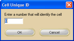
After pressing the "Add" button, a dialog box will require to identify the new cell with a numerical UniqueID (Unique IDentification number): this UnqiueID will be used at runtime to identify existing cells from each other; as you can see on the screenshot below, the User Interface will suggest you the UniqueID: you are in any case free to assign to the new cell the UniqueID you prefer. Pressing the "OK" button will create the new cell and will add it to the cells listbox.
You can now add as many cells as you need and then change the respective settings as explained on the sections below.
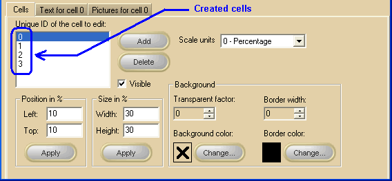
General settings Actually there is no limit to the number of cells you can create inside a control (apart from your PC memory and resources) ; on the screenshot below, you can see that 4 cells have been created and listed inside the white listbox: note that the visible settings are relative to the cell selected inside the listbox: changing the selected cell will cause the various settings to be automatically updated and the Text and Pictures tabs will change their label in order to remember you which of the available cells is under editing. Note: The image below has hot links to take you to explanations of the various controls: the property/method on the right column can be used at runtime.
At runtime you can also: retrieve the total number of available cells using the CellsManager.CellGetCount method and the UniqueID for each of them using the CellsManager.CellGetUniqueID method. understand if a cell with a certain UniqueID exists using the CellsManager.CellFind method.
Text settings for a specific cell Note: The image below has hot links to take you to explanations of the various controls: the property/method on the right column can be used at runtime.
Font related properties can be retrieved/modified at runtime using the CellsManager.CellGetLogFont and CellsManager.CellSetLogFont that will manage a standard Windows LOGFONT data structure.
Pictures settings for a specific cell Note: The image below has hot links to take you to explanations of the various controls: the property/method on the right column can be used at runtime.
|


 symbol) and OpenType (marked with the
 symbol) fonts are supported.
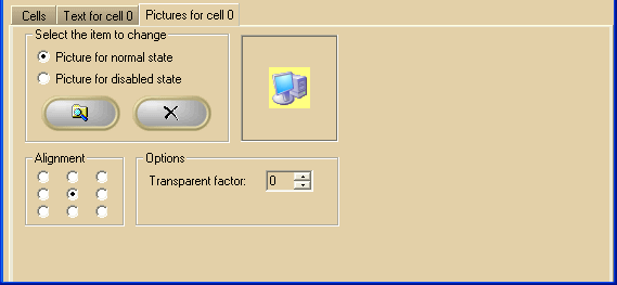
 Browse button
 Delete button